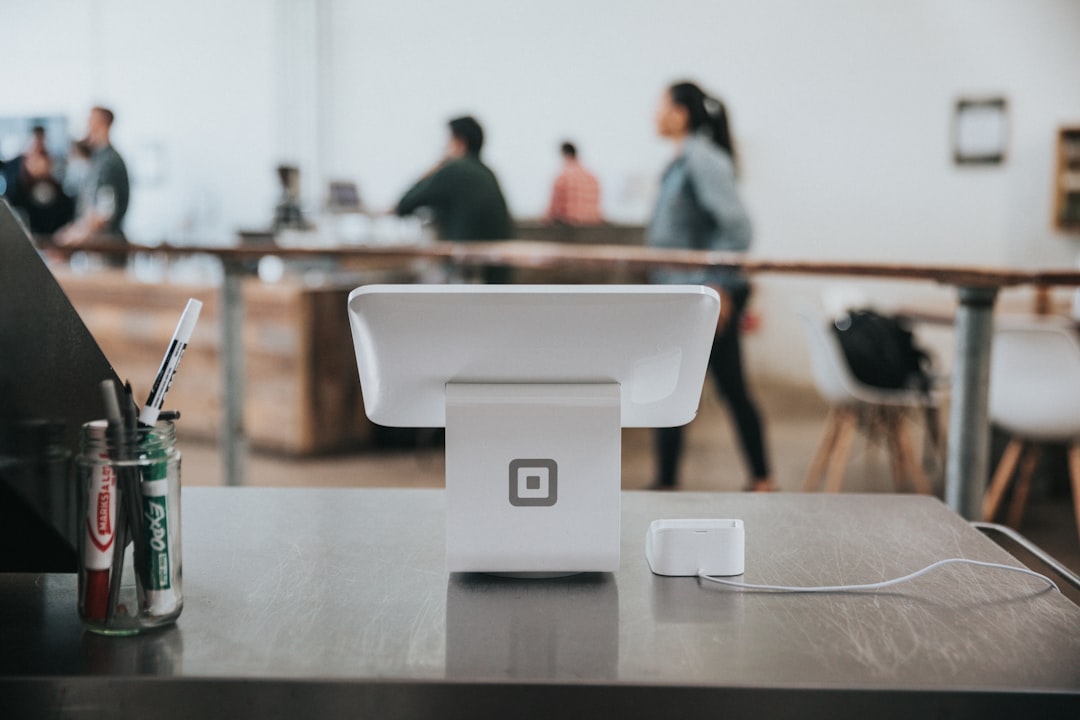
In-store posters are not decoration. They are selling tools that have to earn attention in seconds, compete with shelf clutter, and guide shoppers toward a decision without interrupting the experience. The best poster placement strategy starts with how people move through a store, where their eyes naturally go, and what the lighting does to color, contrast, and legibility. If your store graphics are too small, too glossy, or placed in the wrong sightline, they may be technically “beautiful” while still failing at retail visibility.
This guide takes a merchandising-first approach to poster size, display finish, and placement rules for modern stores. It combines practical production decisions with shopper psychology so you can build promotional signage that works at aisle level, window level, and checkout level. For teams also planning broader print programs, our guides on physical displays that build trust and launch anticipation for new features show how attention can be engineered, not guessed.
Good poster design in retail is a visual hierarchy problem first and a printing problem second. That means deciding what must be seen from 20 feet, what must be read from 6 feet, and what should only reward close inspection. The right answer depends on shopper speed, store type, lighting conditions, and the job the poster is supposed to do—announce a promotion, reinforce branding, explain an offer, or direct traffic. When those variables are clear, your merchandising strategy becomes easier to scale and much more measurable.
1. Start With Shopper Behavior, Not Artwork
Shoppers read stores in layers
Most retail environments work like a series of attention zones. Window shoppers scan from far away, entrance shoppers glance quickly for cues, and aisle shoppers read only when they stop or slow down. A poster meant for the window must communicate in a fraction of a second, while a poster near an endcap can support more detail because the shopper is already physically closer and more engaged. This is why one poster design cannot efficiently serve every placement.
The strongest posters respect the shopper’s motion. If the store flow is fast—such as convenience retail, pharmacies, or high-traffic fashion—use larger type, fewer words, and high contrast. If the store encourages browsing, such as specialty beauty, electronics, or gift retail, you can add supporting detail, but the headline still needs to land instantly. For a broader systems view of retail execution, see choosing workflow tools without the headache and avoiding Black Friday blunders in campaign management.
Match message depth to dwell time
Retail visibility depends on how long a shopper lingers. A poster at the entrance can support a single message and a clear brand cue, because attention there is brief and impression-driven. A poster in a queue line or consultation area can carry more educational content because dwell time is naturally longer. This distinction prevents a common merchandising mistake: overloading high-speed zones with too much copy.
Think in terms of “scan value.” The first 1–2 seconds should deliver the main point, while the next 3–5 seconds can add price, offer terms, or product proof. If your sign has to explain itself before it can persuade, it is probably in the wrong place or too text-heavy. Many teams improve performance simply by trimming copy and moving detailed claims to a nearby secondary sign.
Use the poster as a navigation cue
Posters do more than sell; they also direct movement. A well-placed graphic can pull traffic toward a new aisle, highlight a seasonal table, or slow shoppers near a high-margin zone. In this sense, poster placement is part of store navigation, not just communication. That is why store graphics should align with the path you want people to take, not just open wall space.
For merchandising teams building more complex customer journeys, the logic is similar to planning launch messaging in feature launch anticipation or preparing transparent updates in transparent communication templates. When the message is placed where expectation is already forming, it performs better.
2. Choose Poster Size Based on Viewing Distance and Store Architecture
A simple size rule of thumb
Poster size should be determined by distance, not preference. As a practical rule, the farther away the audience, the larger the headline, and the less copy you should include. A poster that must be read from the opposite side of a store needs oversized typography and simplified layouts, while an in-aisle sign can use smaller secondary information because shoppers are already close enough to inspect it. Oversizing the whole layout is not the goal; readability is.
For most retail environments, a hierarchy of sizes works best. Large format posters are suitable for windows, entry walls, and category anchor points. Mid-size posters are ideal for aisle ends, side walls, and promotional zones. Smaller posters belong near product callouts, checkout queues, or service counters where attention is already concentrated.
Recommended poster formats by placement
| Placement | Typical Viewing Distance | Recommended Poster Size | Primary Goal | Design Priority |
|---|---|---|---|---|
| Store window | 10–30 ft | 24x36 in or larger | Attract foot traffic | Bold headline, minimal copy |
| Entrance wall | 6–20 ft | 18x24 in to 24x36 in | Set campaign tone | Brand cue + offer clarity |
| Endcap | 3–10 ft | 18x24 in | Support product conversion | Readable price and benefit |
| Aisle side panel | 2–6 ft | 11x17 in or 12x18 in | Interrupt browsing | High contrast, short message |
| Checkout or queue | 2–5 ft | 8.5x11 in to 11x17 in | Trigger add-on purchase | Fast read, strong call to action |
These are not rigid standards, but they reflect how shoppers behave in real stores. The key is to make the poster proportionate to the space around it. A huge poster in a narrow aisle can feel aggressive, while a tiny poster on a broad wall can disappear completely. If you want to compare poster strategies with broader format planning, see how physical displays boost trust and the practical display guidance in enterprise-style integration for retail learning environments.
Scale for architecture, not just brand standards
Retail chains often lock into one “standard” poster size across every location, but that approach ignores architectural variation. A tall ceiling, deep window, or unusually wide aisle changes what the eye can catch. A poster that works in a compact convenience store may fail in a large-format home goods store because the physical cues are different. In other words, scale is contextual.
The better method is to create a poster system with approved size families. Use one version for distance viewing, one for mid-range persuasion, and one for close-range conversion. That gives operations teams flexibility while preserving brand consistency. It also makes reprints easier to manage when campaigns change quickly.
3. Finish Matters as Much as Design
Gloss, matte, and satin each solve different problems
The wrong display finish can destroy otherwise strong creative. Gloss finishes increase color pop, but they also reflect light and can become unreadable near windows, spotlights, or shiny fixtures. Matte finishes reduce glare and are often the safest choice for bright stores, though they may appear slightly softer in saturated color. Satin finishes sit between the two and can offer a balanced option for stores with mixed lighting.
Finish should be selected based on the environment the poster will live in. If the poster is near daylight, glass, or metallic shelving, glare management matters more than maximum color punch. If the poster is in a dimmer zone, higher sheen may help the artwork stand out. A sign that looks excellent on a screen may perform badly in a real store because its finish fights the environment.
Durability is a merchandising decision
Retail posters are not always short-lived. Seasonal promotions, loyalty campaigns, and category signs may remain in place for weeks or months. That means the finish has to support durability, not just initial appearance. In humid stores, high-touch zones, or locations with heavy cleaning schedules, a more resilient finish can reduce curling, scuffing, and edge damage.
Technology trends in print matter here. The growth of UV flatbed inkjet printing has expanded options for direct printing on rigid or semi-rigid substrates, which is useful when stores need premium-looking, durable signage with fast turnaround. UV-curable systems also support short-run customization, which is important for chains that localize promotions by region or store cluster. For procurement teams, that flexibility can reduce waste and shorten lead times.
Choose finish by the store’s lighting profile
Pro tip: Always approve poster finish under store lighting, not under office lighting. Many graphics fail because proofing happened in a neutral environment that does not resemble the actual sales floor.
Track lighting, natural light, and LED temperature all change how a poster reads. Warm lighting can mute blue tones, while cool lighting can make white areas feel brighter and more clinical. A glossy finish under multiple point lights often creates hotspots that pull the eye away from the message. Before approving a final spec, test one mockup in the actual location and photograph it from shopper eye level.
For sustainability-conscious merchandising, material and finishing choices should also support waste reduction and easy replacement. That same logic appears in the broader packaging market, where sustainability initiatives are driving new formats and material innovations. For background on sustainable print-adjacent trends, review sustainability-driven packaging innovation trends and compare vendor trade-offs in vendor risk management for procurement teams.
4. Placement Rules: Where Posters Win or Lose Attention
Use the shopper’s natural sightline
Posters perform best when they align with where shoppers already look. Eye level is still the most powerful placement zone, but “eye level” changes by audience and store context. In adult retail, the strongest placements often sit between chest and eye level, where vision naturally settles while walking. In family-oriented stores, lower placements may matter more because children influence attention and parents scan the lower field differently.
Never assume wall space is equal just because it is empty. A poster behind a busy service counter may have less impact than one at the aisle turn where shoppers pause. A sign at the entrance can be seen by everyone, but if the message is too broad, it may not convert. In merchandising, location determines not only visibility but meaning.
Respect the “pause points” in store traffic
Pause points are where shoppers naturally slow down: entry thresholds, endcaps, queue lines, product consultation areas, and intersections between departments. These are the most valuable placements for promotional signage because shoppers have the cognitive bandwidth to process a message. A poster placed in a pause point can do more work than a much larger poster placed in a dead zone.
Shoppers also create pause points around friction. If a customer must decide between two options, compare bundles, or wait in line, attention becomes available. That is the moment to present benefits, not a dense paragraph. Teams that design for these moments typically see better shopper attention and higher conversion efficiency than teams relying on wall coverage alone.
Avoid placement traps that reduce legibility
Some poster locations look attractive on a floor plan but fail in practice. Signs placed too high are missed by average-height shoppers. Signs placed too low can be blocked by product displays, baskets, or other people. Posters near bright windows, reflective fixtures, or cluttered message clusters often lose the hierarchy battle before the shopper even reads them.
One of the most common mistakes is placing competing messages too close together. When every display tries to shout, none of them wins. That is why visual hierarchy is essential: one primary message, one supporting point, one action. If your team wants better campaign execution discipline, it is worth studying the planning rigor in campaign management lessons and the operational framing in small-business workflow selection.
5. Build Visual Hierarchy So the Message Reads in the Right Order
Headline first, proof second, action last
Strong posters communicate in a deliberate sequence. The headline should tell shoppers what the offer or theme is. The supporting line should explain why it matters, and the call to action should tell them what to do next. This order matters because shoppers do not read posters like articles; they scan them for relevance. If the message architecture is inverted, conversion drops.
A useful test is the 3-second test. Ask whether a shopper could identify the core offer, category, or benefit in three seconds from the intended viewing distance. If the answer is no, the layout needs simplification. In-store marketing should be judged by speed of comprehension, not by how much text was approved.
Typography and contrast carry the load
Font choice affects more than style. Heavier weights tend to read faster at distance, while thin, elegant typography may disappear under imperfect lighting or visual clutter. Contrast between text and background should be strong enough to survive glare, store shadows, and color interference from adjacent displays. In practice, a highly legible poster usually outperforms a more decorative one.
Also consider how the poster is read when the shopper is moving. Motion reduces the time available for decoding, so message density must fall as movement speed increases. That is why entrance and aisle posters should feel almost minimalist compared with brochures or shelf talkers. Use the artwork to support the message, not compete with it.
Localize the hierarchy to the buying moment
Different departments need different message hierarchy. In grocery or convenience, price and promotion usually lead. In beauty, performance claims and before/after cues may matter more. In electronics, feature comparison or compatibility details might be the decisive point. Your hierarchy should match the customer’s mental question at that exact placement.
For teams building broader creative systems, the same logic appears in selling creative services to enterprises and in training-based quality systems like association-led quality workshops. The lesson is simple: when the message order matches the decision order, attention converts more efficiently.
6. Lighting, Reflections, and Color Performance in the Real Store
Design for the worst lighting, not the best mockup
Retail lighting can vary dramatically within the same store. One aisle may be under cool LEDs, another under warmer accent lights, and the front window may change character throughout the day. A poster that looks balanced in a studio proof may become washed out or overly dark in the actual environment. Good in-store marketing accounts for those shifts before print approval.
One practical method is to view mockups under three conditions: neutral office light, the actual store light, and near-window daylight if relevant. If the poster remains legible in all three, it is likely robust enough for production. If not, adjust contrast, reduce mid-tone dependence, and reconsider finish.
Use finish to manage glare and color saturation
Gloss and satin finishes can intensify color, which helps campaign posters feel more energetic. But too much sheen can create a mirror effect that competes with the message. Matte finishes often reduce glare enough to protect reading speed, especially on large-format pieces near bright fixtures. The right selection depends on how much ambient light the poster must survive.
Color choices also matter for visibility. High-contrast combinations usually outperform subtle tonal palettes in retail environments because they stay readable under variable lighting. If your brand palette is soft, use a contrasting field or border so the message still separates from the background. This keeps branding intact without sacrificing performance.
Pair the poster with the store’s sensory environment
Visual hierarchy does not exist in a vacuum. It interacts with sound, crowding, fixture density, and even scent. In a busy store, a poster needs to work harder because the customer is processing more stimuli. In a quieter boutique, the poster can be more editorial and emotionally styled, but it still needs a clear action or product cue. Matching the sign to the sensory load improves effectiveness.
For adjacent planning topics, see how physical storytelling environments and curated displays contribute to trust in display storytelling. The same principle applies here: the poster should feel native to the space, not pasted onto it.
7. Production Choices That Improve Visibility Without Inflating Cost
Choose substrates that support the placement
Different placements require different material behavior. Foam board or rigid substrates suit wall-mounted or freestanding posters that need stiffness and a premium look. Paper-based posters may be sufficient for short promotions, but they are more vulnerable to curling, glare, and handling damage. If the sign needs frequent replacement, select a format that can be updated without expensive labor or mounting complexity.
That is where modern digital print systems matter. The flexibility of UV flatbed production helps retailers turn out short runs, localized versions, and durable graphics on demand. For more on the production side of print versatility, the UV flatbed inkjet printer market outlook shows why on-demand rigid printing is becoming more practical for sign programs.
Plan for reprints and campaign turnover
The most efficient posters are designed for change. If a promotion is likely to rotate every two to four weeks, create master templates with editable fields so operations teams can swap dates, prices, and SKUs without redesigning from scratch. This reduces versioning errors and makes store-level rollout much faster. It also keeps brand control centralized while allowing local flexibility.
Retail teams often underestimate the hidden cost of frequent artwork changes. Each extra proof cycle, each mismatched finish, and each rushed reprint creates operational drag. Borrow the planning discipline used in feature rollout economics and forecasting workflows: the cheapest poster is the one that can be deployed correctly the first time and updated predictably later.
Standardize your print specs across the network
When stores buy posters independently, quality drifts. One location prints on bright white stock, another on dull paper, and a third adds laminate that changes reflectivity. Standardizing substrate, finish, bleed, color mode, and size families helps protect brand consistency and visibility. It also reduces vendor comparison time because purchasing teams are comparing like with like.
If your procurement process needs more structure, the vendor-risk principles in procurement vetting and the operational advice in small-business workflow selection are useful models for building a repeatable sourcing checklist.
8. Measuring Poster Performance in the Store
Look beyond subjective feedback
Merchandising teams often rely on opinions such as “that poster looks good” or “customers seem to notice it.” Useful as those impressions are, they are not enough. Better measurement includes sales lift, conversion rate near the promoted zone, dwell time, and movement patterns around the display. Even simple before-and-after comparisons can reveal which placement and finish combinations actually improve outcomes.
If possible, compare similar stores using different poster treatments. For example, test matte versus satin in the same category, or compare a large window poster with a smaller but higher-contrast entrance sign. The point is not to prove one finish is universally better, but to find the best match for each environment. Good merchandising is empirical.
Use quick diagnostics after installation
After a poster is installed, do a walk-through from shopper eye level. Ask three questions: Can I see it clearly from the intended distance? Does it compete with nearby signs? Does the finish create glare or dullness under this light? These checks take minutes and often catch problems that design approvals miss.
Also observe how long it takes a shopper to notice the sign naturally. If staff have to explain the message repeatedly, the poster may not be doing its job. One of the simplest indicators of success is whether the sign reduces explanation time and increases self-service understanding.
Refine the system, not just the design
Measurement should feed back into the poster system. If a certain finish performs well in window placements but poorly in aisle signage, separate those specs in your template library. If smaller formats outperform larger ones in queue areas, make that a standard. Continuous improvement comes from documenting placement, size, finish, and results together.
For teams managing multiple categories or stores, this is the same logic used in benchmarking programs and dynamic personalization strategy: measure the variables that actually change performance, then systematize them.
9. Practical Poster Planning Checklist for Merchandising Teams
Define the objective before selecting size
Every poster should have one clear job. Is it attracting traffic, explaining a promotion, reinforcing the brand, or pushing add-on sales? Once the objective is clear, the size and placement almost choose themselves. A traffic-driving window poster needs distance readability, while a checkout poster needs immediate comprehension and a sharp call to action.
When teams skip this step, they create overly flexible creative that does nothing especially well. The objective should determine copy length, font scale, and the amount of supporting detail. That keeps the poster aligned with real commercial intent rather than internal preference.
Validate lighting and sightlines on site
Before print approval, stand where the shopper stands. Check whether the poster is blocked by fixtures, if the light creates glare, and whether the message can be read while walking past. This field validation often reveals that a great layout on a laptop is too delicate for a retail floor. Site truth always wins over design-room assumptions.
If you have multiple locations, identify the common lighting environments and create placement-specific specs. That makes rollouts more reliable and speeds up approvals. It also reduces the chance that stores will improvise their own versions.
Build a reusable poster spec sheet
A good spec sheet should include size, bleed, safe zone, color profile, finish, substrate, installation method, and approved placement. Add viewing distance and lighting notes so the printer and store team understand why the poster is built the way it is. This turns the poster from a one-off art file into a managed retail asset.
For stores running broader promotional calendars, this kind of control is as important as inventory discipline. Systems thinking is what makes signage scalable, and the operational mindset parallels the best practices discussed in forecasting tools and promotion management.
10. Real-World Scenarios: Which Poster Setup Works Best?
Scenario 1: Bright storefront with heavy daylight
In a store with large windows and changing daylight, a matte or low-sheen finish is usually the safest choice. Use a large headline, compact copy, and strong contrast so the sign survives reflections at multiple times of day. Place the poster where it is visible from outside but not directly washed by glare. If the window area is busy, consider a rigid substrate to maintain flatness and premium appearance.
Scenario 2: Narrow aisle with fast-moving traffic
Here, the poster must work almost like a traffic sign. A smaller format with bold typography, a single offer, and minimal supporting detail usually performs better than a large, crowded layout. Matte finish is often preferable because shoppers are close to the sign and multiple light sources can create hotspots. Install the poster at a clean sightline where the aisle turns or opens.
Scenario 3: Premium boutique with slower browsing
Premium environments can support more editorial design, but the hierarchy still has to be immediate. Satin finishes often work well because they preserve richness while limiting glare. Larger posters can tell a brand story, yet the core message should still be readable at a glance. In this setting, posters often function best as atmosphere setters plus conversion nudges.
Pro tip: If a poster is meant to be admired, it still has to be understood. A beautiful sign that does not sell is decorative cost, not merchandising value.
Frequently Asked Questions
What is the best poster size for in-store marketing?
The best size depends on viewing distance and placement. For windows and entry areas, larger formats like 24x36 inches are common because shoppers view them from farther away. For aisles and checkout areas, smaller formats often work better because the audience is already close. Choose size based on the shopper’s path, not just available wall space.
Should retail posters be matte or glossy?
Matte is usually safer in bright stores because it reduces glare and improves legibility. Gloss can make colors pop, but it can also cause reflections that make text harder to read. Satin is a useful middle option when you want some vibrancy without as much glare. The best choice depends on lighting, distance, and whether the poster is behind glass.
Where is the best place to put a promotional poster in a store?
The best placements are usually high-traffic pause points such as entrances, endcaps, queue lines, and department intersections. These are places where shoppers naturally slow down and can process a message. Avoid spots where the sign is blocked, too high, too low, or competing with too many other messages. Visibility is strongest when the poster fits the shopper’s natural sightline.
How much copy should an in-store poster have?
Usually less than brands think. In high-speed areas, one headline and one supporting point are enough. In slower browsing areas, you can add a little more detail, but the message should still be scan-friendly. If the shopper needs to read paragraphs to understand the offer, the poster is too dense.
How do I test whether a poster is working?
Start with a field check at the actual location, then measure behavior and sales. Look for improved noticeability, reduced explanation time from staff, stronger traffic to the promoted area, and better conversion near the sign. A/B testing different size or finish treatments across similar stores can show which configuration performs best. The goal is to link design decisions to measurable retail outcomes.
Can one poster design work across all store formats?
Usually not without adjustments. Stores differ in size, lighting, aisle width, and shopper speed, so the same creative often needs different sizes, finishes, or copy depth. A system of templates is better than one universal file. That way, you preserve brand consistency while adapting to local merchandising conditions.
Conclusion: Design Posters Like Retail Tools, Not Wall Art
Posters work in stores when they match how shoppers move, what they can see, and how long they can pay attention. That is why poster placement, display finish, and poster size should always be chosen together. A strong creative idea can fail if it is too small, too reflective, too crowded, or placed in the wrong part of the store. A simple, well-positioned sign with the right finish can outperform a more expensive design that ignores the realities of retail visibility.
The best merchandising teams treat posters as part of a system: they standardize specs, validate in real lighting, and measure results by store behavior, not by subjective taste alone. If you are expanding your in-store marketing program, the next step is to build a placement matrix and finish guide for each store type. For more support on display strategy, sourcing, and execution, explore physical storytelling displays, UV flatbed print capabilities, and vendor risk planning to make your signage program more reliable and profitable.
Related Reading
- How Trade Workshops Are Reshaping Quality Standards - Learn how training and standards improve print and display consistency.
- Benchmarking Advocate Programs for Legal Services - A useful model for measuring program performance and outcomes.
- Measuring Feature Rollout Costs - A practical framework for planning repeatable, scalable updates.
- Smart Stock for Small Producers - Forecasting lessons that translate well to campaign and signage planning.
- Selling Creative Services to Enterprises - Helpful for teams managing creative approvals and buyer expectations.


